What does 'done' mean anyway? I suppose there will always be a tweak to be made or re-arrangement to be arranged, but I'd like to have some semblance of order to start clean. Think it'll work?
Nah, I didn't either. But I can try, right?
My latest victim is our bedroom - my mind has been a flurry of thoughts around how to make it more feminine. In its current state, there is too much man. Black furniture, beige walls, and green curtains, lampshades, and bedding. There are no feminine elements except for my jewelry/makeup area, and the '...and they lived happily ever after' sign above the double window.
So it's time to bring in some estrogen! All the furniture will stay, but anything made of fabric is up for grabs. Even the bedskirt has to go, since we'll be upgrading to a king bed sooner than later...
So I decided to
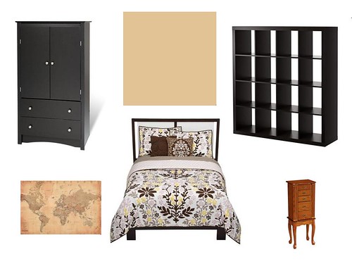
Option 1:
See how boring our paint color and furniture are? I love my Expedit, but it is so boxy and intimidating. I think I can dress it with some photos or favorite mementos of trips we've taken to take care of that tout de suite.
I LOVE this bedding - "Mandala" by Dwell Studio for Target!! It's not too girly and pink, but I'm digging its feminine vibe. Even Dave said he wouldn't mind this - that surprised me a little!
Art is the question - I found a lovely framed map at Target that I love! I do not love the $189 price tag, though. I found this almost-identical unframed version on Amazon - I could mod podge it onto a canvas to glam it up a little (like YHL's horse poster project)...
...or I could create some cute, personalized art like this yarn-wrapped monogram set? I heart this project!!
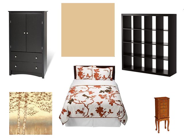
Option 2:
See how not girly it is? I know, it doesn't fit the bill, but I really like the bold burnt orange color in the bedding - "Perch" (also by Dwell Studio). Bonnie had a good point about the birds staring at you from those branches though ;) Might give me nightmares.
I love the birch silhouette piece from, you guessed it, Target. It reminds me of a painting hanging in the basement when I was growing up. I never paid much attention to it until high school - when my boos (Carrie, Cynthia, and Mo) came over for sleepovers we'd name the trees in the painting to correspond with boys we liked at the time. I know, I don't get why we did it either, but we did. We even ranked them so the trees in the foreground were named after guys we were either dating (yeah, right) or reallllly liked. Guys we thought were cute or completely unattainable *cough*TugCoker*cough* were banished either to the blurry background trees or the clumps of really skinny trees.
Come on, you were 15 once, too. You totally did things like that!! Right?
So there are our options. I'm definitely leaning toward option 1 - what do you think? On board for the bedding but not the art? Love it all? Think we need new furniture too? That last one is impossible for now, but it's fun to get opinions ;)


I vote for option 1! Love that bedding better than the other. :D
ReplyDeletei like option number 1 it looks perfect for you guys!
ReplyDeletei want to try and do that monogram thing too looks fun!